Student Project Manager: Grace Coll
Student Team Members:
Chris Holguin
Akari Ohashi
Grace Coll
Web cookies (also called HTTP cookies, browser cookies, or simply cookies) are small pieces of data that websites store on your device (computer, phone, etc.) through your web browser. They are used to remember information about you and your interactions with the site.
Session Management:
Keeping you logged in
Remembering items in a shopping cart
Saving language or theme preferences
Personalization:
Tailoring content or ads based on your previous activity
Tracking & Analytics:
Monitoring browsing behavior for analytics or marketing purposes
Session Cookies:
Temporary; deleted when you close your browser
Used for things like keeping you logged in during a single session
Persistent Cookies:
Stored on your device until they expire or are manually deleted
Used for remembering login credentials, settings, etc.
First-Party Cookies:
Set by the website you're visiting directly
Third-Party Cookies:
Set by other domains (usually advertisers) embedded in the website
Commonly used for tracking across multiple sites
Authentication cookies are a special type of web cookie used to identify and verify a user after they log in to a website or web application.
Once you log in to a site, the server creates an authentication cookie and sends it to your browser. This cookie:
Proves to the website that you're logged in
Prevents you from having to log in again on every page you visit
Can persist across sessions if you select "Remember me"
Typically, it contains:
A unique session ID (not your actual password)
Optional metadata (e.g., expiration time, security flags)
Analytics cookies are cookies used to collect data about how visitors interact with a website. Their primary purpose is to help website owners understand and improve user experience by analyzing things like:
How users navigate the site
Which pages are most/least visited
How long users stay on each page
What device, browser, or location the user is from
Some examples of data analytics cookies may collect:
Page views and time spent on pages
Click paths (how users move from page to page)
Bounce rate (users who leave without interacting)
User demographics (location, language, device)
Referring websites (how users arrived at the site)
Here’s how you can disable cookies in common browsers:
Open Chrome and click the three vertical dots in the top-right corner.
Go to Settings > Privacy and security > Cookies and other site data.
Choose your preferred option:
Block all cookies (not recommended, can break most websites).
Block third-party cookies (can block ads and tracking cookies).
Open Firefox and click the three horizontal lines in the top-right corner.
Go to Settings > Privacy & Security.
Under the Enhanced Tracking Protection section, choose Strict to block most cookies or Custom to manually choose which cookies to block.
Open Safari and click Safari in the top-left corner of the screen.
Go to Preferences > Privacy.
Check Block all cookies to stop all cookies, or select options to block third-party cookies.
Open Edge and click the three horizontal dots in the top-right corner.
Go to Settings > Privacy, search, and services > Cookies and site permissions.
Select your cookie settings from there, including blocking all cookies or blocking third-party cookies.
For Safari on iOS: Go to Settings > Safari > Privacy & Security > Block All Cookies.
For Chrome on Android: Open the app, tap the three dots, go to Settings > Privacy and security > Cookies.
Disabling cookies can make your online experience more difficult. Some websites may not load properly, or you may be logged out frequently. Also, certain features may not work as expected.
Student Project Manager: Grace Coll
Student Team Members:
Chris Holguin
Akari Ohashi
Grace Coll



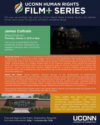
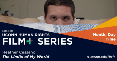
Drafts: 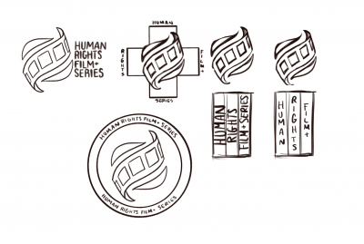
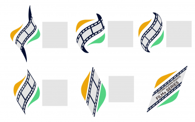 Final and Secondary:


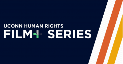
 Color Palette:
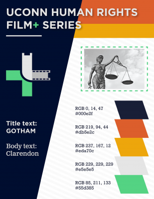 Typography:






Team: Aida Brueckner Alisia Gruendel Gillian Partyka Michael Russell Heather Rutishauser
Good Deed Entertainment (GDE) entrusted us with a unique challenge – effectively market the innovative film "Summertime" to a younger audience. Focused on spoken word poetry and rap, the film required an immersive campaign targeting 18-30-year-olds, primarily university students, globally. The objective was to cultivate an engaged viewer base and transform them into dedicated fans.
Tiffany Terilli
Liam McNeece
Jenny Pehota
Rosalie Garcia
The primary goal of this project was to breathe life into Talkwalker's AI voice, Tobin, through an animated caricature. Tobin, envisioned as a mid-30s, approachable, and encouraging professional, serves as the visual representation of Talkwalker's international marketplace. The target audience consists of business professionals seeking certification in the Talkwalker program, requiring Tobin to be relatable and reflective of the current workplace dynamics influenced by the COVID-19 environment.
The project was executed through a collaborative effort within the team:
The team adhered to a structured schedule, meeting in class every Tuesday and Thursday. Additional bi-weekly sessions with Talkwalker facilitated ongoing communication and ensured alignment with their expectations.
Several challenges were encountered throughout the project:
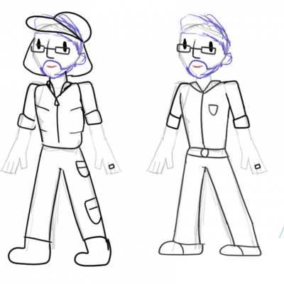
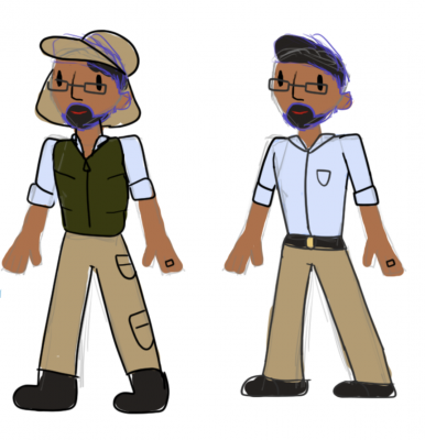

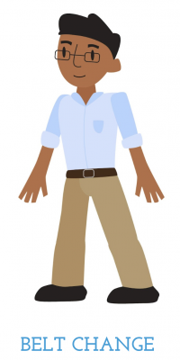
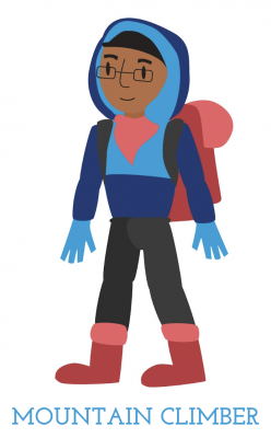
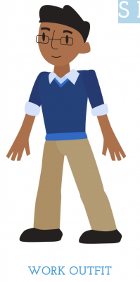
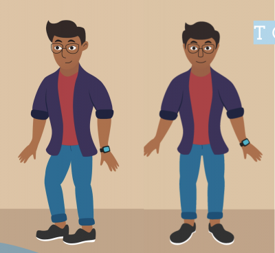
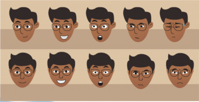
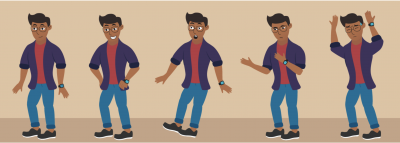
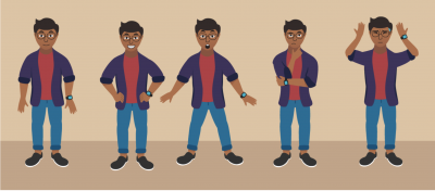

Client feedback played a pivotal role in shaping Tobin's final design:
The project honed various skills and provided valuable lessons:
The Tobin project not only enhanced the team's design capabilities but also demonstrated the importance of effective communication and adaptability in delivering a successful client project within the unique context of a virtual environment.
Team members:
Christina
Emilee
Jonathon
Nicole
Ryan
The collaborative efforts with the Mashantucket Pequot Museum and Research Center encompassed the successful execution of three significant projects aimed at enhancing visitor experiences and promoting safety. These projects included a website redesign, a COVID safety video, and the creation of a 2D map wayfinding design.
The website redesign project sought to revitalize the online presence of the Mashantucket Pequot Museum and Research Center. The objectives included:
In response to the unique challenges posed by the COVID-19 pandemic, a safety video was developed to ensure the well-being of museum visitors and staff. Key project highlights include:
The 2D map wayfinding design project was initiated to enhance the visitor experience within the museum. Project objectives included:
Through these three major projects, the collaboration with the Mashantucket Pequot Museum and Research Center has significantly improved the visitor experience. The website redesign, COVID safety video, and 2D map wayfinding design collectively contribute to the museum's commitment to education, safety, and engagement. These projects serve to enrich the cultural and historical journey for all who visit the museum, both in person and virtually.
Team:
Student Project Manager: Jon Pico
Harrison Burr
Matthew Gatchalian
Jonathan Pico
Dana Santillana
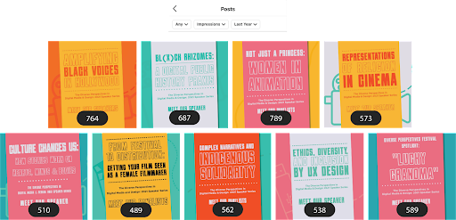
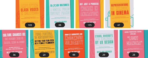
Based on the inequities that have historically shaped digital media content, fields, and careers, the UConn Digital Media & Design department created the Diverse Perspectives Speaker Series. The series welcomes industry professionals, artists, and scholars from film, game, design, cultural and other sectors to discuss how issues of equity manifest in their work, creative processes, and professions. This series allows us to reflect on how our own practice can support greater equity, diversity, and inclusion.
To drive awareness and engagement for a wide array of talented and diverse digital creators through a brand-new speaker series, hosted by the Digital Media and Design Department, in a fully virtual setting. In addition, to grow the overall DMD following across social with an emphasis on Youtube and Instagram.
| Primary | Secondary |
|
|
Jenny Pehota
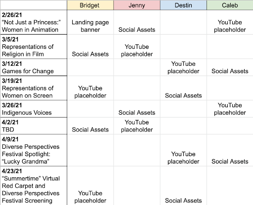
Project manager, asset creator, GDE Liaison
Bridget Sweeney
Website planner, asset creator, logo designer
Caleb White
Asset Creator, logo designer
Destin Brown
Asset creator, logo designer

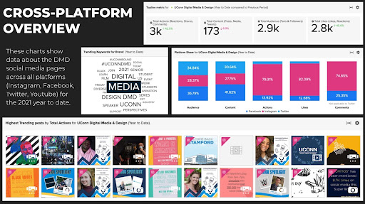
The UConn Digital Media & Design YouTube page has seen a 36% increase in subscriber growth since the start of the series, increasing from 154 to 209 subscribers.
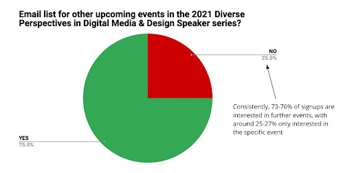
75% of viewers displayed interest in the series long-term, but our viewership did not fully reflect that. We believe fewer events would retain this viewership.

The majority of views in this series were not live. In a semester of constantly living in accordance with a virtual schedule, this is not surprising. Viewers preferred to watch the series after it "aired"

“During my time in the Diverse Perspectives class I had the pleasure of being a Student Moderator for Dr. Heidi Boisvert's presentation. Dr. Boisvert's work includes mapping the first media genome to analyze how our brains react to the media we are exposed to. Ultimately this research is made with the hope that we can use this technology to easily predict the type of media a user would be more likely to enjoy and engage with. I was nervous for the presentation, mainly because Dr. Boisvert had conducted a large Ted Talk with over a million views last year on the same subject so I felt I had a lot to live up to. Once I entered the Sound Check, my worries wisped away. Dr. Boisvert explained her work in media and technology and I got to ask her questions from our class. It was awesome when Dr. Boisvert said, "You made my day" when I expressed my gratitude for being able to meet and interview her. Diverse Perspectives was a perfect send off to my time at UConn. Being able to expose myself to engaging pieces of content created by individuals I don't directly relate with has molded me into a mature and multifaceted digital media analyst who's ecstatic to continue to explore the diverse world of media ahead of him.”
-Joseph Schiro (DMD 5th year)

The Connecticut Outdoor and Environmental Education Association (COEEA) is dedicated to building a vibrant network of individuals, educators, and organizations committed to fostering outdoor education and environmental literacy. This project encompasses a range of initiatives aimed at invigorating COEEA's branding, website, and marketing efforts to expand their reach and impact.
A significant component of this project involved rebranding COEEA, breathing new life into its visual identity, and aligning it with the organization's mission. The following key steps were undertaken:

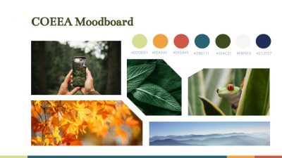
The COEEA website received a comprehensive update to enhance user experience and engagement:
Efforts to expand COEEA's reach and engagement spanned various channels:
The COEEA project encapsulates a holistic approach to rebranding, refreshing the website, and enhancing marketing efforts. The result is a revitalized and engaging platform for promoting outdoor education and environmental literacy, creating new opportunities for growth and collaboration within the COEEA community.
The team:
Julia Padget
Emily Saleski
Katelyn Jepsen
Marcella Vertefeuille