Pursue Care Outreach Campaign

November 28, 2023

Client Overview:

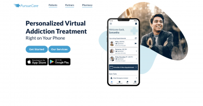
Pursue Care, a groundbreaking app designed to assist individuals recovering from opioid addiction or facing mental health challenges, provides a discreet platform for connecting users with therapists, doctors, and psychologists for prescription support. Recognizing the sensitivity surrounding opioid addiction, Pursue Care sought to expand its reach into the college demographic and engaged students to create an engaging card game as part of an innovative expo booth strategy.

Project Scope:

The project aimed to target college students and break down barriers related to seeking support for opioid addiction and mental health. The focal points included:

  1. Demographic Expansion:

    • Tailor Pursue Care's services and messaging to resonate with the college demographic.
    • Address the unique challenges and stigma associated with mental health within the college community.
  2. Expo Booth Engagement:

    • Devise a creative and interactive strategy to attract college students to the Pursue Care expo booth.
    • Develop a captivating card game that not only entertains but also educates attendees about the app's services.

Approach:

  1. Demographic Research:

    • Conducted thorough research on the college demographic, understanding their attitudes toward mental health and potential barriers to seeking support.
    • Gathered insights from focus groups and surveys to inform the creation of targeted messaging.
  2. Card Game Development:

    • Collaborated with Pursue Care to understand their brand messaging and desired outcomes for the card game.
    • Brainstormed and developed a card game concept that seamlessly integrated education about Pursue Care's services with an engaging and enjoyable gameplay experience.
  3. Design and Branding:

    • Designed the card game with attention to the visual identity and branding elements of Pursue Care.
    • Ensured the game's aesthetics aligned with the overall messaging of destigmatizing mental health support.
  4. Expo Booth Execution:

    • Worked closely with Pursue Care to create an expo booth layout that maximized visibility and engagement.
    • Integrated the card game as a centerpiece of the booth, encouraging students to participate and learn more about Pursue Care.

Outcomes:

  • Successfully expanded Pursue Care's reach into the college demographic, fostering awareness and engagement.
  • Created an interactive card game that not only entertained expo attendees but also effectively communicated the app's mission and benefits.
  • Received positive feedback from students, breaking down stigma and encouraging open conversations about mental health.

Conclusion:

The Pursue Care Outreach Campaign for the College Demographic effectively combined strategic demographic targeting with creative engagement methods, achieving the dual goals of expanding awareness and fostering positive conversations around mental health within the college community. The card game proved to be a valuable tool in connecting with students and promoting the app's services in a relatable and accessible manner.
Laughing Fork Farm Marketing Transformation

Client Overview:

Laughing Fork Farm, nestled in the serene landscapes of upstate New York, is a sustainable organic farm dedicated to fostering eco-friendly agricultural practices. The project aimed to revolutionize Laughing Fork Farm's digital presence through an extensive digital marketing plan encompassing social media, website enhancement, reshaped icons, and a comprehensive overhaul of the brand's visual identity, including a new logo and branding strategy.

Project Scope:

The primary objective was to elevate Laughing Fork Farm's visibility in the digital sphere, aligning its online presence with the values of sustainability, organic farming, and the unique charm of upstate New York. Key components of the project included:

  1. Social Media Strategy:

    • Develop a robust social media plan tailored to Laughing Fork Farm's audience.
    • Generate engaging content showcasing sustainable farming practices, community involvement, and the farm's natural beauty.
    • Foster a sense of connection with followers through interactive posts, stories, and behind-the-scenes glimpses.
  2. Website Enhancement:

    • Redesign and optimize Laughing Fork Farm's website for a more intuitive user experience.
    • Highlight the farm's story, values, and products through visually appealing and informative content.
    • Implement e-commerce capabilities to facilitate online sales and product promotion.
  3. Reshaped Icons:

    • Create reshaped icons that visually represent Laughing Fork Farm's commitment to sustainability, organic farming, and community.
    • Ensure the icons align with the overall brand aesthetic and effectively convey key messages.
  4. New Logo:

    • Design a new logo that encapsulates the essence of Laughing Fork Farm.
    • Incorporate elements symbolizing sustainability, organic farming, and the unique character of upstate New York.
    • Ensure the logo is versatile and suitable for various digital and print applications.
  5. New Branding:

    • Develop a comprehensive branding strategy that extends beyond the logo to encompass a unified visual identity.
    • Establish a consistent color palette, typography, and imagery that reflect Laughing Fork Farm's values and resonate with the target audience.
    • Apply the new branding across various touchpoints, including digital and print materials.

Approach:

  • Conducted in-depth research on Laughing Fork Farm's target audience, industry trends, and competitor landscape.
  • Collaborated closely with the client to understand the farm's unique story, values, and goals.
  • Engaged in iterative feedback loops to refine and tailor design elements to meet Laughing Fork Farm's vision.

Outcomes:

  • Launched a cohesive and engaging social media presence, fostering a growing online community around Laughing Fork Farm.
  • Redesigned and optimized the farm's website, providing visitors with an immersive and informative online experience.
  • Introduced reshaped icons that visually communicate the farm's commitment to sustainability and organic practices.
  • Unveiled a new logo that serves as a visual anchor for Laughing Fork Farm's brand identity.
  • Implemented a comprehensive branding strategy, ensuring consistency across all digital and print materials.

Conclusion:

The Laughing Fork Farm Digital Marketing Transformation successfully rejuvenated the farm's online presence, positioning it as a beacon of sustainable agriculture in upstate New York. Through thoughtful design, strategic planning, and a focus on authenticity, Laughing Fork Farm now stands poised to connect with a broader audience, sharing its story and values with the world.

SmartSeal – Blockchain Provenance For Physical Products Marketing

Client Overview:

SmartSeal, a groundbreaking NFT company based in Manchester, CT specializes in integrating NFT tags onto clothing and artwork. These digital tokens empower creators and consumers by enabling them to scan the tags, facilitating a range of activities, from trading and selling to purchasing and accessing exclusive content like movies or documentaries.

Project Scope:

The primary focus of this project was to market SmartSeal's innovative product in the digital realm. Key areas of attention included crafting a compelling marketing strategy, establishing a robust online presence through website development, and implementing an effective social media strategy to enhance brand visibility.

Objectives:

  1. Product Marketing:

    • Develop a comprehensive marketing plan to highlight the unique benefits of Smartseal's NFT tags.
    • Showcase the ease of trading, selling, buying, and accessing exclusive content through the digital tags.
  2. Website Development:

    • Build a user-friendly and visually appealing website that reflects the innovation and sophistication of Smartseal's NFT offerings.
    • Ensure seamless navigation for users interested in learning about and engaging with the product.
  3. Social Media Strategy:

    • Create and execute a social media strategy to establish Smartseal as a prominent player in the NFT space.
    • Generate engaging content to foster a community around Smartseal, encouraging interaction and brand advocacy.

Approach:

  1. Product Marketing:

    • Conducted market research to understand the target audience and tailor marketing messages accordingly.
    • Developed compelling narratives emphasizing the transformative impact of Smartseal's NFT tags on the fashion and art industries.
    • Highlighted the versatility of the product, showcasing its applications in trading, selling, buying, and exclusive content access.
  2. Website Development:

    • Collaborated with SmartSeal to design and build a visually appealing website that aligns with the brand's identity.
    • Implemented user-friendly features and intuitive navigation to enhance the overall user experience.
    • Ensured the website effectively communicates the value proposition of Smartseal's NFT tags and provides easy access to essential information.
  3. Social Media Strategy:

    • Identified key social media platforms for SmartSeal's target audience.
    • Developed a content calendar with a mix of promotional content, educational material about NFTs, and behind-the-scenes glimpses of SmartSeal's operations.
    • Utilized engaging visuals, including images and videos, to create a dynamic and captivating social media presence.
    • Encouraged user-generated content and interaction to foster a sense of community around the SmartSeal brand.

Outcomes:

  • Successfully launched SmartSeal's digital marketing campaign, generating awareness and interest in their NFT products.
  • Established an aesthetically pleasing and user-friendly website that serves as a central hub for information and engagement.
  • Implemented a social media strategy that resulted in increased brand visibility, audience engagement, and community building within the NFT space.

Conclusion:

The SmartSeal Marketing and Branding project effectively positioned the company as an innovative player in the NFT ecosystem. By focusing on strategic marketing, website development, and a dynamic social media strategy, the project contributed to the growth and success of SmartSeal, ensuring they stand out in the competitive landscape of digital fashion and art.

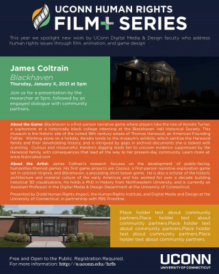
UConn Human Rights Film + Series Branding

November 27, 2023

film-series-logo

Potential Initiatives

  1. Stylescapes & Focus Group:
    • Conducted initial research and generated stylescapes.
    • Adapted to changes by eliminating the need for a focus group.
  2. Create Logo and Refine Brand Identity:
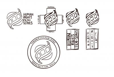
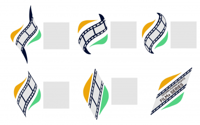
    • Developed a primary logo and secondary logos/badges.
    • Maintained brand consistency through color usage guidelines.
  3. Posters, Flyers, Digital Signage:
    • Created engaging visual assets for promotional materials.
    • Adapted the timeline to address changes in deliverables.
  4. Animated Bumper:
    • Produced an animated bumper for enhanced brand recognition.
  5. Film Reel & Title Card:
    • Adapted to changes by dropping the idea of a film reel.
    • Developed a title card for consistency across platforms.
  6. Social Media Templates:
    • Created templates for consistent branding on social media.
    • Adapted to feedback and changing requirements.
  7. Website Assets:
    • Initially planned to design a website shell but dropped the idea.
    • Adapted to changes in assets and requirements.

Challenges & Opportunities

Challenges:

  • Building a brand from scratch.
  • Lack of tangible assets for the non-existent brand.
  • Competition with film companies with substantial COVID-era marketing resources.
  • Crafting a memorable identity with easy name recognition.

Opportunities:

  • No pre-existing identity allows creative freedom.
  • Unique position as the only public college human rights film series.
  • Exploiting new opportunities presented by COVID for wider audience reach.
  • Connecting diverse audiences through collaboration with different departments.

Adapting to Change:

  • Eliminated the focus group due to similar client reactions.
  • Reduced workload by dropping the film reel and website shell.
  • Incorporated feedback into deliverables through email and Zoom communication.
  • Adjusted the timeline as assets and requirements evolved.

Process

Moodboard:

  • Captures the essence of the UConn Human Rights Film+ Series.
  • Passionate, humanitarian, and contemporary vibes.
  • Blends light and dark contrasts for a striking presence.
  • Main colors and aesthetics inspired by the unique imagery of the films.

Logo and Brand Identity:

  • Primary logo combines modern style with classical film iconography.
  • Utilizes bold shapes, bright colors, and a flame-like design.
  • Secondary logos and badges serve as peripheral identifiers.
  • Emphasizes consistency in usage, color, and presentation.

Drafts: Final and Secondary:   Color Palette:

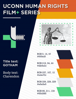
  • Limited to five colors representing different entities within the Film+ Series.
  • Gray, yellow, orange, green, and navy blue convey warmth, maturity, and energy.
  • Consistent use reinforces the brand's identity and emotional impact.

Typography:
  • Consistent use of Gotham and Clarendon typefaces.
  • Reflects the modern and energetic feel of the series.
  • Predominantly used for advertisements, posters, and promotional material.

Posters:

  • Developed visually engaging poster designs for film promotions.

Social Media Content:

  • Created assets for consistent branding on social media platforms.

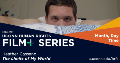
Facebook Headers:

  • Designed headers for Facebook to enhance brand visibility.

Animation:

  • Produced an animated bumper for dynamic brand representation.

Title Card:

  • Developed a title card for uniformity across various platforms.

Team: Aida Brueckner Alisia Gruendel Gillian Partyka Michael Russell Heather Rutishauser

Good Deed Entertainment: Summertime

November 14, 2023

Overview

Good Deed Entertainment (GDE) entrusted us with a unique challenge – effectively market the innovative film "Summertime" to a younger audience. Focused on spoken word poetry and rap, the film required an immersive campaign targeting 18-30-year-olds, primarily university students, globally. The objective was to cultivate an engaged viewer base and transform them into dedicated fans.

Process

  1. Research - TikTok Demographics: Conducted comprehensive research on TikTok demographics, emphasizing users aged 18-24 who form 42% of the platform's audience. Emphasized TikTok's vitality, with 16% of videos tied to hashtag challenges, and noted that positive emotions triggered virality.
  2. Brainstorming Ideas: Collaboratively generated innovative ideas for a TikTok-centric campaign, considering the film's themes and target audience's preferences.
  3. Virtual Events, Lyric Videos, and TikTok Campaign:
    • Hosted virtual events for college students globally.
    • Created engaging lyric videos of poems used in the movie.
    • Initiated a TikTok campaign featuring snippets, challenges, and fan interactions.

TikTok Campaign:

  • Content:
    • Utilized scenarios with and without actors.
    • Shared snippets of songs/poems, clips from the movie, and encouraged fan interaction.
    • Leveraged TikTok trends and challenges.
  • Campaign Calendar:
    • Scheduled postings strategically.
    • Developed a variety of content to maintain audience interest.
  • TikTok Concepts:
    • Introduced hashtag challenges, duets, and engaging scenarios related to the film's themes.
    • Utilized popular trends like #CrucialCatch, #ILoveMyMama, and others to enhance visibility.

Team

  • Tiffany (Project Manager):
    • Facilitated communication with the client and actors.
    • Ensured approval before posting videos.
  • Liam (Video Editor):
    • Edited clips from the movie for TikTok.
  • Jenny (TikTok Manager):
    • Managed TikTok editing, posting, and engagement.
    • Collaborated with influencers.
  • Rose (Secretary):
    • Documented meeting notes for future reference.

Achievements

  • Grew TikTok account significantly.
  • Created engaging content and achieved viral success.
  • Increased followers, likes, comments, and views.
    • 5135% follower growth
    • 9938% likes growth
    • 4291% views growth
  • Reached out to micro-influencers in the poetry realm, receiving positive feedback.

Skills Used

  • Video editing
  • Communication
  • Organization
  • Time management
  • Social media
  • Research

What We Learned

  • Insights into the entertainment industry's workings.
  • Coordinating between talent and executives.
  • Professional communication practices.
  • Effective execution of a social media campaign.

Challenges

  • Scheduling and obtaining deliverables from talent.
  • Building an audience from scratch.
  • Challenges in executing specific challenges.

Moving Forward

  • GDE can continue TikTok management for sustained engagement.
  • Post regularly, emphasizing film release details.
  • Collaborate with talent for ongoing content.
  • Reach out to larger influencers for promotion.
  • Utilize TikTok trends and platforms to expand reach.
  • Invest in a lyric video as additional marketing content.
  • Consider virtual events closer to the film premiere.

Tiffany Terilli

Liam McNeece

Jenny Pehota

Rosalie Garcia

Talkwalker Character Design

November 13, 2023

Objectives & Target Market

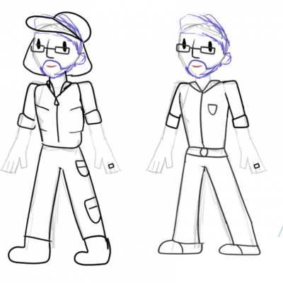
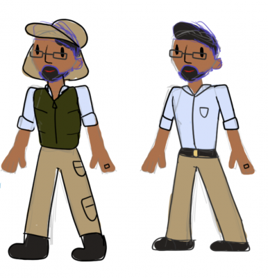
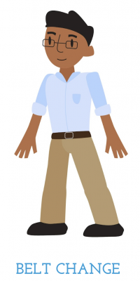
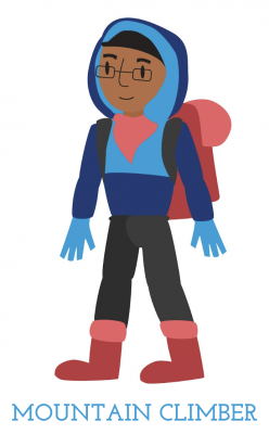
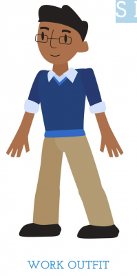
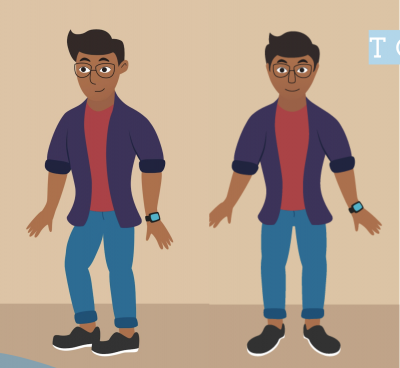
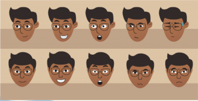
The primary goal of this project was to breathe life into Talkwalker's AI voice, Tobin, through an animated caricature. Tobin, envisioned as a mid-30s, approachable, and encouraging professional, serves as the visual representation of Talkwalker's international marketplace. The target audience consists of business professionals seeking certification in the Talkwalker program, requiring Tobin to be relatable and reflective of the current workplace dynamics influenced by the COVID-19 environment.

Process

The project was executed through a collaborative effort within the team:

  • Christina, Emilee, and Ryan contributed insights into the Talkwalker program, guiding the development of Tobin's character based on their extensive knowledge.
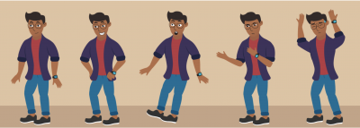
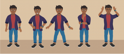
  • Nicole and Jonathon took charge of Tobin's creation, meticulously designing character sheets and ensuring Tobin's overall visual representation aligns with the project's objectives.

Schedule

The team adhered to a structured schedule, meeting in class every Tuesday and Thursday. Additional bi-weekly sessions with Talkwalker facilitated ongoing communication and ensured alignment with their expectations.

Challenges

Several challenges were encountered throughout the project:

  • Difficulties in obtaining timely approval from the higher-ups at Talkwalker.
  • Periods of limited feedback due to Talkwalker's busy schedule.

Sketches & First Draft

Second Draft & Redesign

Character Sheets

Reactions from the Client

Client feedback played a pivotal role in shaping Tobin's final design:

  • The team maintained regular communication with the client through weekly meetings and email exchanges.
  • Client reactions were overall positive, leading to a successful collaboration and a design that aligned with their vision for Tobin.
  • A mid-semester redesign was implemented to enhance Tobin's fit with the desired vision, demonstrating the team's adaptability and commitment to client satisfaction.
  • The client expressed extreme satisfaction with the final Tobin design.

Skills Used and Lessons Learned

The project honed various skills and provided valuable lessons:

Skills:

  • Advanced character design skills were expanded and refined.
  • Understanding the intricacies and timelines involved in comprehensive character design.
  • Enhanced communication skills, crucial for effective teamwork and client interaction in a virtual environment.

Lessons:

  • Consideration of client review time is essential for successful project management.
  • Clear identification of key decision-makers within the client team is crucial for efficient approvals and feedback incorporation.

The Tobin project not only enhanced the team's design capabilities but also demonstrated the importance of effective communication and adaptability in delivering a successful client project within the unique context of a virtual environment.

Team members:

Christina

Emilee

Jonathon

Nicole

Ryan

Mashantucket Pequot Museum Spring 2021

November 8, 2023

The collaborative efforts with the Mashantucket Pequot Museum and Research Center encompassed the successful execution of three significant projects aimed at enhancing visitor experiences and promoting safety. These projects included a website redesign, a COVID safety video, and the creation of a 2D map wayfinding design.

Website Redesign

The website redesign project sought to revitalize the online presence of the Mashantucket Pequot Museum and Research Center. The objectives included:

  • A comprehensive overhaul of the existing website to reflect a contemporary and user-friendly design.
  • Improved navigation and accessibility, ensuring visitors can easily access information about the museum's exhibitions, collections, events, and educational programs.
  • Integration of multimedia elements to enrich the user experience and provide a compelling virtual tour of the museum.
  • Streamlined content management and a fresh layout, all optimized for mobile devices to accommodate a wide range of visitors.

COVID Safety Video

In response to the unique challenges posed by the COVID-19 pandemic, a safety video was developed to ensure the well-being of museum visitors and staff. Key project highlights include:

  • Creation of a detailed safety video highlighting essential health and safety measures, such as mask-wearing and social distancing.
  • Clear communication of the museum's commitment to ensuring a safe and enjoyable visit.
  • Production of visually engaging content that educates visitors on the protocols in place and fosters a sense of security.

2D Map Wayfinding Design

The 2D map wayfinding design project was initiated to enhance the visitor experience within the museum. Project objectives included:

  • Development of a clear and user-friendly 2D map guiding visitors through the museum's diverse exhibitions, galleries, and amenities.
  • Integration of intuitive wayfinding elements to facilitate navigation and maximize visitors' exploration of the museum.
  • Creation of a visually appealing map that aligns with the museum's branding and identity.

Conclusion

Through these three major projects, the collaboration with the Mashantucket Pequot Museum and Research Center has significantly improved the visitor experience. The website redesign, COVID safety video, and 2D map wayfinding design collectively contribute to the museum's commitment to education, safety, and engagement. These projects serve to enrich the cultural and historical journey for all who visit the museum, both in person and virtually.

Team:

Student Project Manager: Jon Pico

Harrison Burr

Matthew Gatchalian

Jonathan Pico

Dana Santillana

DMD Diverse Perspectives Series

November 7, 2023

What is Diverse Perspectives

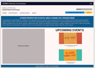
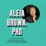
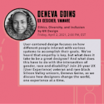
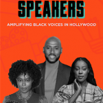
Based on the inequities that have historically shaped digital media content, fields, and careers, the UConn Digital Media & Design department created the Diverse Perspectives Speaker Series. The series welcomes industry professionals, artists, and scholars from film, game, design, cultural and other sectors to discuss how issues of equity manifest in their work, creative processes, and professions. This series allows us to reflect on how our own practice can support greater equity, diversity, and inclusion.

The Objective

To drive awareness and engagement for a wide array of talented and diverse digital creators through a brand-new speaker series, hosted by the Digital Media and Design Department, in a fully virtual setting. In addition, to grow the overall DMD following across social with an emphasis on Youtube and Instagram. 

Target Audience

Primary Secondary
  • UConn Students
  • UConn Alumni
  • UConn professors and staff
  • current and future filmmakers
  • directors
  • people in the industry
  • potential students
  • University students on a larger scale
  • parents of students


Team

Jenny Pehota

Project manager, asset creator, GDE Liaison

Bridget Sweeney

Website planner, asset creator, logo designer

Caleb White

Asset Creator, logo designer

Destin Brown

Asset creator, logo designer

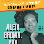
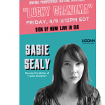
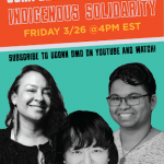
Social Assets and Organization

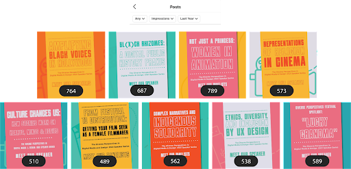
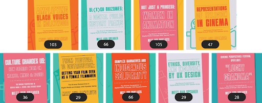
Social Media Graphics

Social Media Story Assets

Growth

YouTube Channel Growth

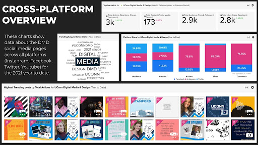
The UConn Digital Media & Design YouTube page has seen a 36% increase in subscriber growth since the start of the series, increasing from 154 to 209 subscribers.

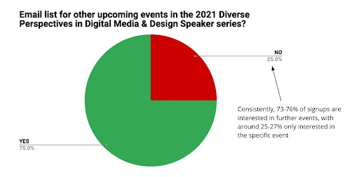
75% of viewers displayed interest in the series long-term, but our viewership did not fully reflect that. We believe fewer events would retain this viewership.

The majority of views in this series were not live. In a semester of constantly living in accordance with a virtual schedule, this is not surprising. Viewers preferred to watch the series after it "aired"


Diverse Perspectives Student Testimonial

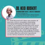
“During my time in the Diverse Perspectives class I had the pleasure of being a Student Moderator for Dr. Heidi Boisvert's presentation. Dr. Boisvert's work includes mapping the first media genome to analyze how our brains react to the media we are exposed to. Ultimately this research is made with the hope that we can use this technology to easily predict the type of media a user would be more likely to enjoy and engage with. I was nervous for the presentation, mainly because Dr. Boisvert had conducted a large Ted Talk with over a million views last year on the same subject so I felt I had a lot to live up to. Once I entered the Sound Check, my worries wisped away. Dr. Boisvert explained her work in media and technology and I got to ask her questions from our class. It was awesome when Dr. Boisvert said, "You made my day" when I expressed my gratitude for being able to meet and interview her. Diverse Perspectives was a perfect send off to my time at UConn. Being able to expose myself to engaging pieces of content created by individuals I don't directly relate with has molded me into a mature and multifaceted digital media analyst who's ecstatic to continue to explore the diverse world of media ahead of him.”

-Joseph Schiro (DMD 5th year)

Concluding Thoughts

How We met the Objective

  • Developed series strategy while adhering to a fully virtual setting
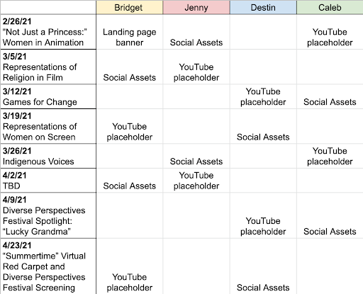
  • Created weekly assets for promotional usage across all UConn DMD accounts, while maintaining a fresh but cohesive look
  • Worked closely with Agency X and UConn SMACC to roll out assets and measure performance
  • Engaged audience through UConn DMD Instagram page promotionals for the event
  • Grew the UConn DMD YouTube page by a 33% increase in subscribers

Skills Used

  • Asset creation through Adobe Photoshop, Illustrator, InDesign, and Premiere
  • Communication
  • Organization
  • Time Management

What We Learned

  • Learned to operate in a fast-paced environment
  • Adapted to changing priorities
  • Advanced collaboration skills through working with internal team members, as well as through partnerships with Agency X, UConn SMACC, Good Deed Entertainment, and other organizations

Challenges

  • Creating assets with quick turnaround time
  • Last minute changes in lineups, times, headshot preferences, and bios
  • Some events were TBD
  • Having a middle-man communication style led to unnecessary confusion with deadlines, and delays in the asset generation process
  • Zoom burnout

What Worked

  • Partnerships with speakers and organization
  • Collaboration with Agency X
  • Switching off design responsibilities each week
  • Style guide & Color palette

What Didn't Work

  • Events every week
  • Quick turnaround times on approval-oriented assets
  • Final event overlapping with finals week

Moving Forward

  • Change speaker events to be on a biweekly or monthly basis
  • Leverage testimonials from people who took the Diverse Perspectives course in social posts
  • Use identified clips for future promotions
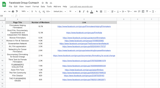
  • Post events in relevant Facebook groups
  • Assign the responsibility of creating assets to a group from a graphic design background, or make sure a students with a strong visual background is a part of the team
    • Could send out the opportunity through email to the DMD department as a whole
  • Build out time in advance for Agency X, UConn SMACC, and group members to meet and plan out marketing strategies and schedule

COEEA Spring 2021

November 6, 2023

Who is COEEA?

The Connecticut Outdoor and Environmental Education Association (COEEA) is dedicated to building a vibrant network of individuals, educators, and organizations committed to fostering outdoor education and environmental literacy. This project encompasses a range of initiatives aimed at invigorating COEEA's branding, website, and marketing efforts to expand their reach and impact.

Project Description

  1. New Branding
  2. Website Refresh
  3. Expanding Marketing Efforts

Branding Refresh:

A significant component of this project involved rebranding COEEA, breathing new life into its visual identity, and aligning it with the organization's mission. The following key steps were undertaken:

  • New Logo: A fresh logo was designed, serving as the centerpiece of the revitalized branding, capturing the essence of COEEA's commitment to outdoor education and environmental awareness.
  • Style Guide: A comprehensive style guide was crafted, providing clear guidelines for consistent visual representation.
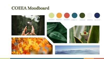
  • Unique Color Scheme: A distinctive color palette was established to set COEEA apart from traditional environmental brands, introducing a unique color that adds depth to the brand's personality.
  • Typography: Two unique fonts were carefully selected to maintain brand coherence across all communications.
  • Social Media Branding: COEEA's social media presence was harmonized with the style guide through branded templates and design elements.

Website Refresh:

The COEEA website received a comprehensive update to enhance user experience and engagement:

  • New Logo Integration: The fresh logo was seamlessly integrated into the website's design, reflecting the updated branding.
  • New Colors and Fonts: The website embraced the new color palette and fonts to maintain a cohesive look.
  • Improved UI/UX: User interface and experience were optimized through content reorganization and the introduction of a prominent "JOIN" button for easy access to membership.
  • Engaging Content: Large text areas were divided, and imagery was added or updated to create a more visually appealing and informative website.

Marketing Enhancement:

Efforts to expand COEEA's reach and engagement spanned various channels:

  • Increased Web Traffic: The launch of the revamped website was supported by strategic social media posts, directing the audience to explore the new site.
  • Social Media Marketing: A comprehensive social media strategy was implemented, harnessing analytics to understand audience preferences and creating posting calendars, including templates for various content types.
  • Enhancing Interactivity: COEEA's social media presence was invigorated by engaging with outdoor and nature accounts, fostering interaction and growing followers on all platforms. An email template was designed to strengthen communication with members and stakeholders.
Conclusion

The COEEA project encapsulates a holistic approach to rebranding, refreshing the website, and enhancing marketing efforts. The result is a revitalized and engaging platform for promoting outdoor education and environmental literacy, creating new opportunities for growth and collaboration within the COEEA community.

The team:

Julia Padget

Emily Saleski

Katelyn Jepsen

Marcella Vertefeuille