
Potential Initiatives
- Stylescapes & Focus Group:
- Conducted initial research and generated stylescapes.
- Adapted to changes by eliminating the need for a focus group.
- Create Logo and Refine Brand Identity:
- Developed a primary logo and secondary logos/badges.
- Maintained brand consistency through color usage guidelines.
- Posters, Flyers, Digital Signage:
- Created engaging visual assets for promotional materials.
- Adapted the timeline to address changes in deliverables.
- Animated Bumper:
- Produced an animated bumper for enhanced brand recognition.
- Film Reel & Title Card:
- Adapted to changes by dropping the idea of a film reel.
- Developed a title card for consistency across platforms.
- Social Media Templates:
- Created templates for consistent branding on social media.
- Adapted to feedback and changing requirements.
- Website Assets:
- Initially planned to design a website shell but dropped the idea.
- Adapted to changes in assets and requirements.
Challenges & Opportunities
Challenges:
- Building a brand from scratch.
- Lack of tangible assets for the non-existent brand.
- Competition with film companies with substantial COVID-era marketing resources.
- Crafting a memorable identity with easy name recognition.
Opportunities:
- No pre-existing identity allows creative freedom.
- Unique position as the only public college human rights film series.
- Exploiting new opportunities presented by COVID for wider audience reach.
- Connecting diverse audiences through collaboration with different departments.
Adapting to Change:
- Eliminated the focus group due to similar client reactions.
- Reduced workload by dropping the film reel and website shell.
- Incorporated feedback into deliverables through email and Zoom communication.
- Adjusted the timeline as assets and requirements evolved.
Process
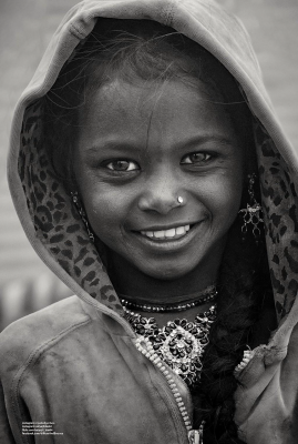
Moodboard:
- Captures the essence of the UConn Human Rights Film+ Series.
- Passionate, humanitarian, and contemporary vibes.
- Blends light and dark contrasts for a striking presence.
- Main colors and aesthetics inspired by the unique imagery of the films.


Logo and Brand Identity:
- Primary logo combines modern style with classical film iconography.
- Utilizes bold shapes, bright colors, and a flame-like design.
- Secondary logos and badges serve as peripheral identifiers.
- Emphasizes consistency in usage, color, and presentation.
Drafts: 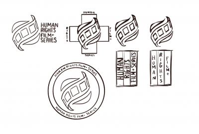
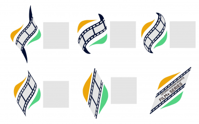 Final and Secondary:



 Color Palette:
- Limited to five colors representing different entities within the Film+ Series.
- Gray, yellow, orange, green, and navy blue convey warmth, maturity, and energy.
- Consistent use reinforces the brand's identity and emotional impact.
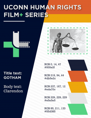 Typography:
- Consistent use of Gotham and Clarendon typefaces.
- Reflects the modern and energetic feel of the series.
- Predominantly used for advertisements, posters, and promotional material.

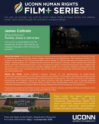
Posters:
- Developed visually engaging poster designs for film promotions.


Social Media Content:
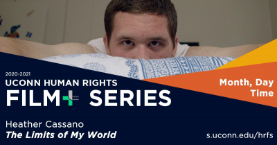
- Created assets for consistent branding on social media platforms.


Facebook Headers:
- Designed headers for Facebook to enhance brand visibility.


Animation:
- Produced an animated bumper for dynamic brand representation.
Title Card:
- Developed a title card for uniformity across various platforms.
Team: Aida Brueckner Alisia Gruendel Gillian Partyka Michael Russell Heather Rutishauser